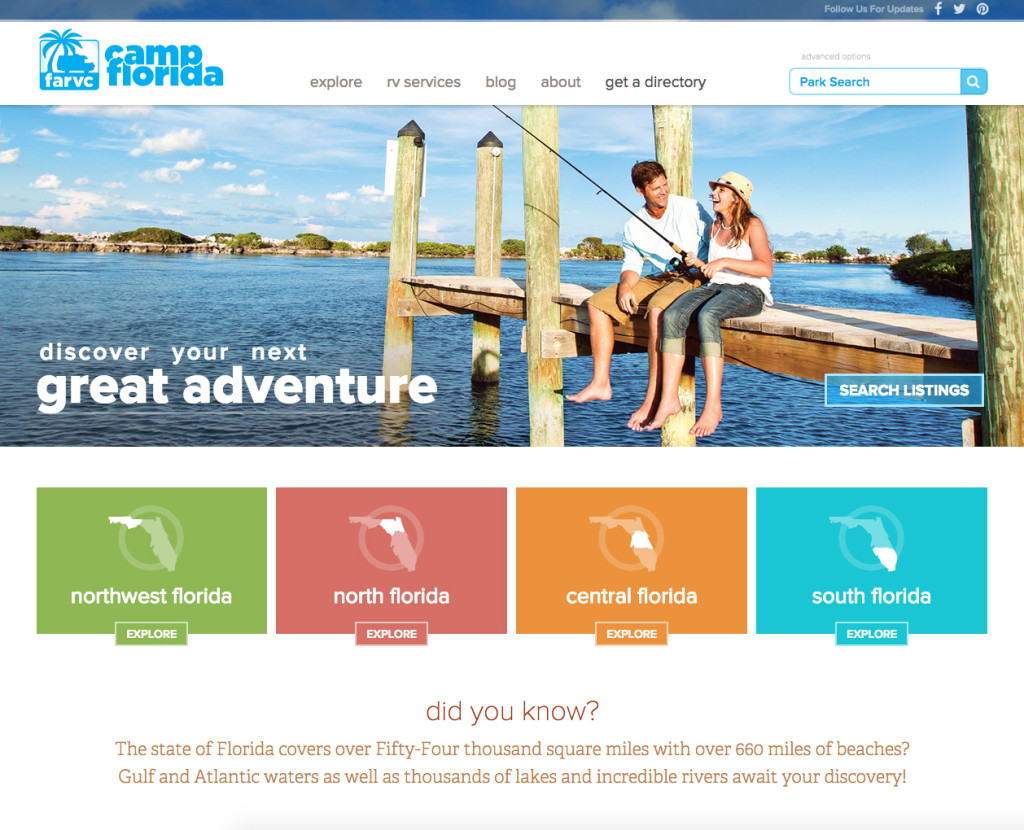
Florida Tourism Gets an Upgrade
As a major voice in Florida’s booming tourism industry, Camp Florida helps thousands of campers plan their dream vacation each year. Fun in the sun may sound like a Sunshine State trope, but to these guys it’s a way of life. Their visitors expect access to a vast database, stuffed with the very best the business has to offer, and the easier it is to sift, the better.
A Fresh Spin on a Familiar Brand
Before moving on Camp Florida’s main focus, the new website, we determined (and the client agreed) that a general decluttering and streamlining of their old logo was necessary. Since they weren’t quite ready for a full brand refresh, we agreed on a simple massage of their current materials into an easier, more relaxed style.
In this case, less was more: fewer colors and text objects, plus a simpler, more identifiable icon. We tested four different RV bodies in this space, an attempt to spotlight the great diversity attracted by the campground culture, but ultimately decided to just stick with the original. It was a fun experiment, but the classic style is both familiar and easy to recognize.
Further adjustments led right into the design of the site itself; a sleek, smooth font change and a clear, direct new tagline. The font is a real breath of fresh air, lively and organic with a strong spirit and a friendly, welcoming nature. Some playful character interactions (like the intertwined C/F) give the mark a little bounce and a cheerful, perky attitude.
Cleanliness, Composition and Clarity
With over four-hundred campground listings in their database (more added every day), browsing and sorting Camp Florida’s member sites in a simple, intuitive way is far easier said than done. That’s why we’ve placed a heavy emphasis on information flow and contextual clarity throughout the new design.
Big, clean chunks of content break up the layout, at once dressing the page and segmenting its contents. Where iconography will suffice unaccompanied, we’ve let it do just that – after all, isn’t a picture worth a thousand words? Maybe a few more? Choosing the perfect campsite is difficult enough as it is, why shouldn’t the discovery process be as straightforward and transparent as it can be?
Spotlight on Photography
That open, clean page layout works doubly well as a matte for the member resorts’ sharp, impressive photography. Whether it’s on a splash page or a content-rich camp detail screen, potential visitors are going to expect to be impressed by the kind of rich, beautiful landscapes our state has grown famous for. Stock is simply not an option – authentic, relevant photography can make or break a campground’s chances. Fortunately, this is one area where that deep member database really comes into play; Camp Florida’s parks have so many stunners to share, we were really just cherry-picking the best of the best.
The GravityFree team has been great to work with and very responsive to our organization’s needs. They have great ideas, are very quick to act and implement changes, and are always open to my suggestions and feedback.
Bobby Cornwell, Florida Association of RV Parks and Campgrounds
Tell a Tale with Color
One aspect we really wanted to carry over from the client’s annual print catalog was a sparing, effective dose of color theming for each of Florida’s four geographical regions. Used effectively, the extra splash of flavor would not only add to the page’s personality, but also subtly differentiate one grouping from the next at a single glance. These accents are effectively established on the home page, where they work in unity with the large, stirring masthead image, then reinforced by way of subtle accents and highlights on the internal pages. A light, playful way to keep the page alive without interrupting the flow of information or interfering with the bigger, more powerful photographic elements.
Harnessing the Power of the Modern Browser
As the art of web development continues to evolve, the bag of tricks at our disposal becomes more versatile and appropriate. Every new project offers fresh opportunities to try something new and exciting, and Camp Florida is no exception.
Of course, like all of our modern sites, campflorida.com is fully responsive and retina-friendly. Its layout automatically adjusts itself to maximize the screen real estate at all sizes, from smartphone to tablet, all the way up to a widescreen desktop. SVG icons and custom webfonts ensure the text and graphics look great on every screen… and will continue to do so regardless of the shapes, sizes and resolutions Apple and Google decide to introduce in next year’s models.
Given Florida’s grand geography, effective, efficient mapping is also a primary concern. We’ve worked a little magic with Google’s services in this regard, giving users a very large, very familiar method for locating and booking their ideal vacation. Within our campground detail pages, the member’s location inside the state is remarkably easy to pinpoint in both a broad and a granular sense: two stylish overlaid maps work together to cover those bases.
Discover Your Next Great Adventure
With just a few careful UX tweaks, a long-overdue pruning of extraneous content and the disciplined application of white space, we feel we’ve made a major contribution to one of the core players in Florida’s adventure and tourism industry. Guests will be pleased to find their hunt for the perfect campground greatly simplified, getting them to the information they’re after in fewer clicks than ever before, and happy surfers make happy campers. But don’t take our word for it; explore for yourself at CampFlorida.com. We think you’ll be blown away.
Case Studies
The Miracle League of Manasota
Written by GravityFree
Friday, February 3rd, 2017
Case Studies
Naugahyde
Written by GravityFree
Friday, May 1st, 2015
Case Studies
McCurdy’s Comedy Club
Written by GravityFree
Monday, April 20th, 2015


